
Branding + Design + UI/UX
Atlantic Communications Team
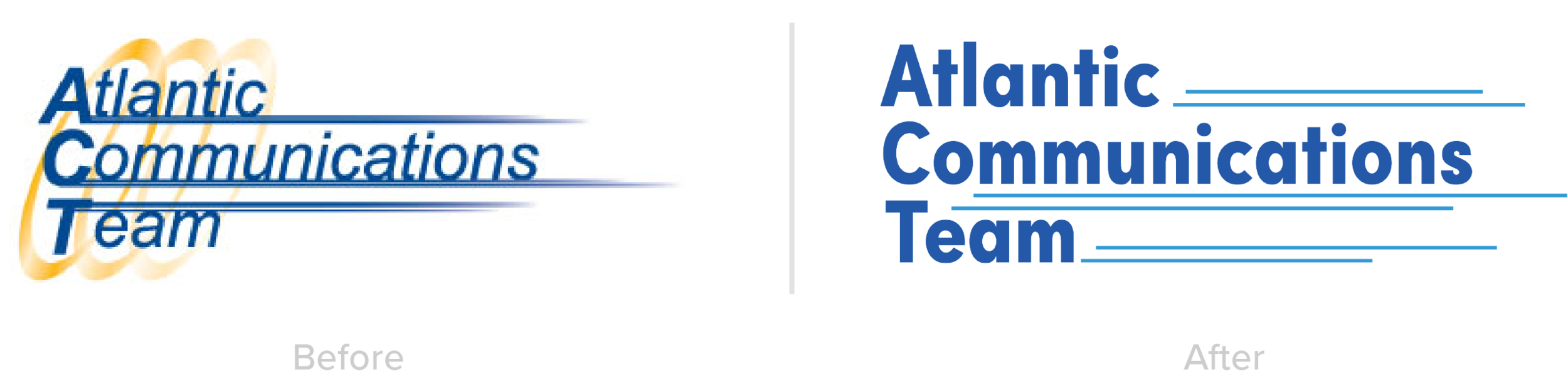
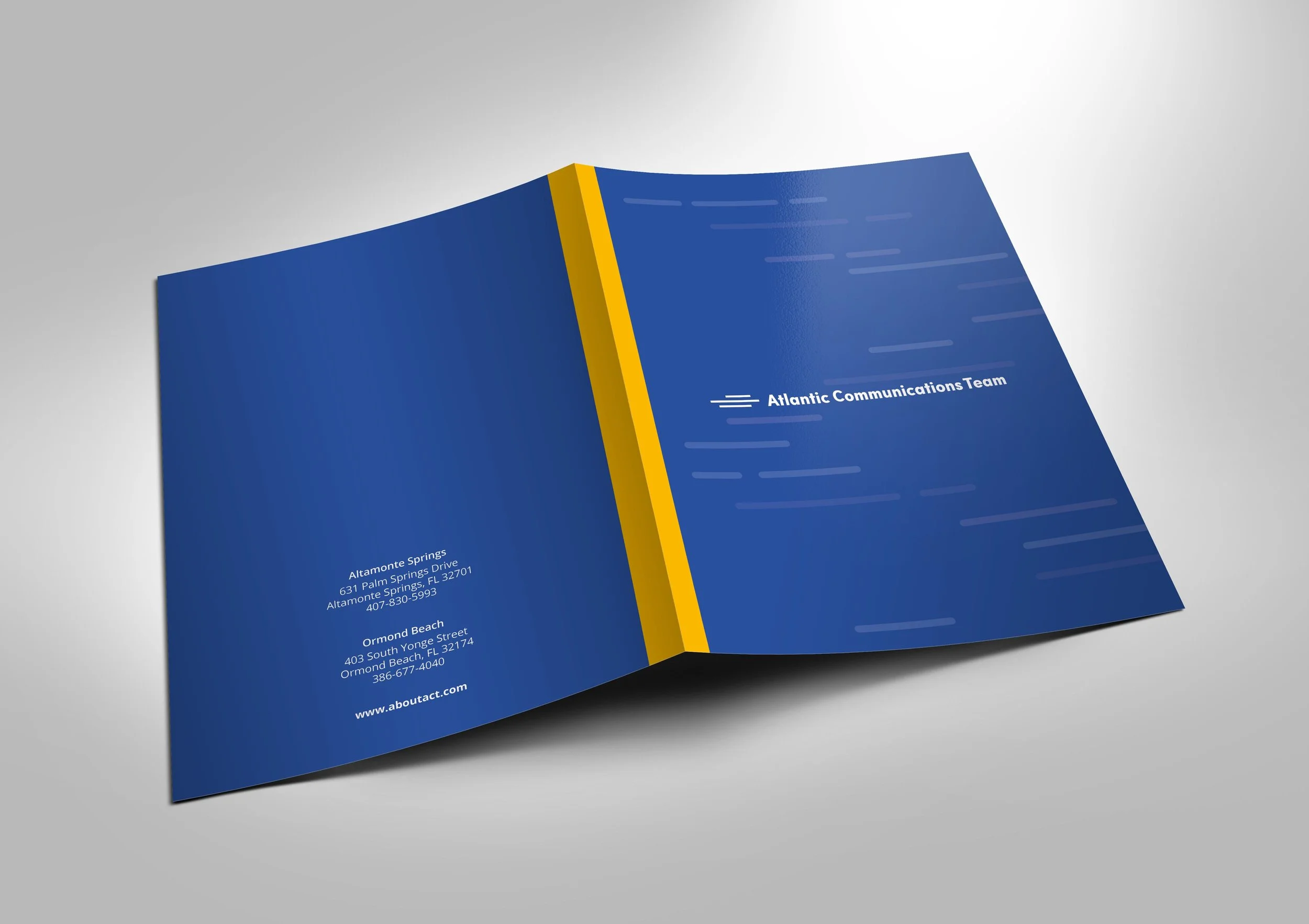
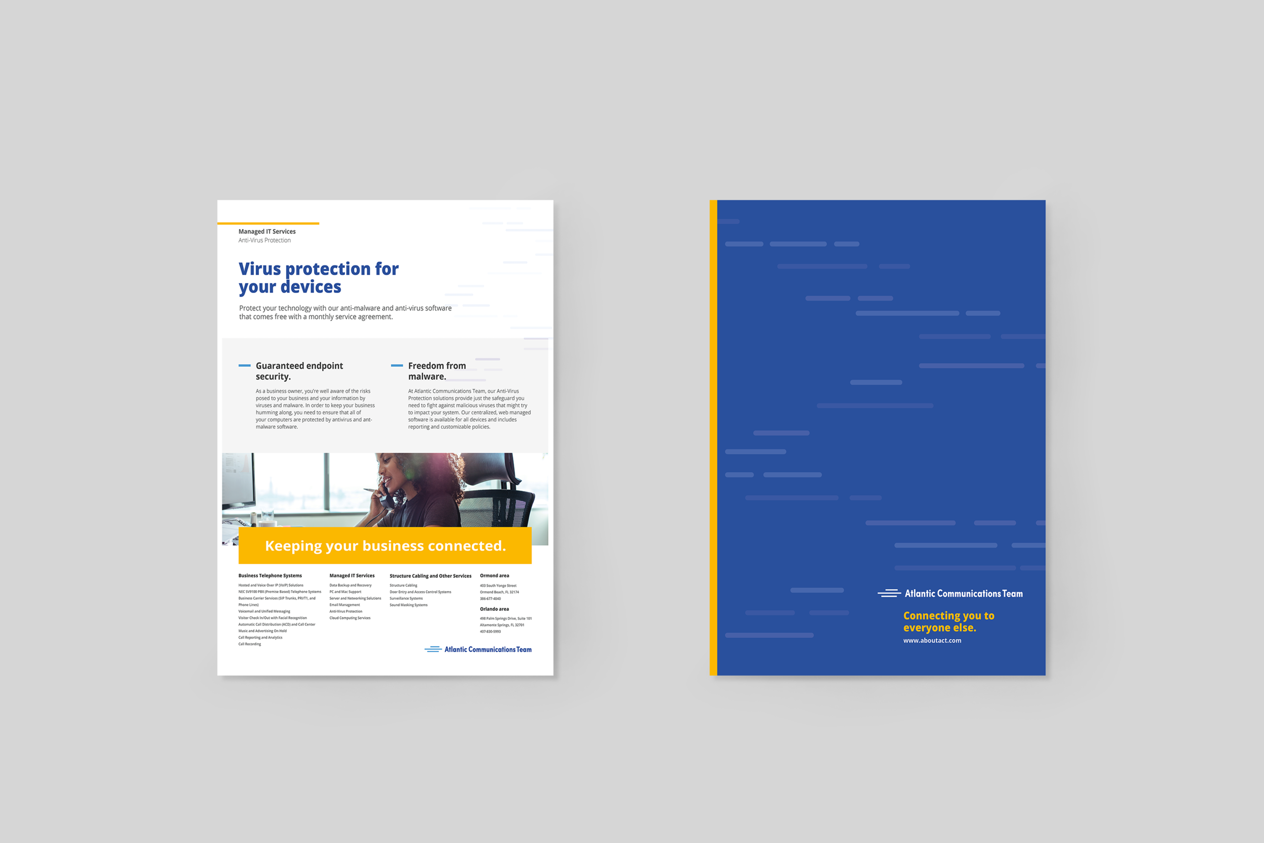
Atlantic Communications Team is a communication, data, and networking systems company. Their logo was severely dated, I kept the same idea but just gave it a nice refresh. I chose a different typeface — a nice sans serif that had some personality to it while still being professional. The logo before had the lines shooting out from the name, and with the company being a data driven company the lines to show progress and movement seemed fitting, so I made them into mono-weight lines as well as gave them this monotone look to blend with the logo, but keeping them interwoven into the name to show speed, power and agility, almost like the name itself is moving. Where as before they are the same blue, I made them a slightly offset blue to give depth to the logo and also to distinguish the lines from the name, so it does not get lost in the name itself. I created a long version where the name is on one line and the lines are on the left side of the name, creating almost an icon or mark. This ads for versatility because now we have the option of having the lines and text as one, the lines as an ‘icon’ we can use both with and without the text. I did pay homage to the gold yellow in the logo by adding it into the branding materials as you can see below. I also took inspiration from the logo to create this line pattern I used in the branding, creating a sense of movement throughout the brand, correlating back to the logo.


Creating a compelling and energetic brand for an IT company is step 1, step 2 is putting all that into a website, one that has pages on pages of content. This was no easy task to try and figure out how we were going to disseminate all the content they had and services they provided into an organized and easy way to swallow. But through, breaking up the content into it’s own respectable content areas, and dividing those areas into sections and subsections with the use of color and some of our branding elements, such as the use of lines, the site is easy to navigate through and does not seem so daunting.

© New York Ave. and Atlantic Communications Team