
Branding + Design + UI/UX
K12 Lift


Make it stand out
This was a fun animated graphic I did for the brand presentation of K12 Lift. The animation visually expresses the idea behind the logo. The idea that K12 Lift will put in place procedures to help lift kids test scores and in doing so create a positive educational drive.
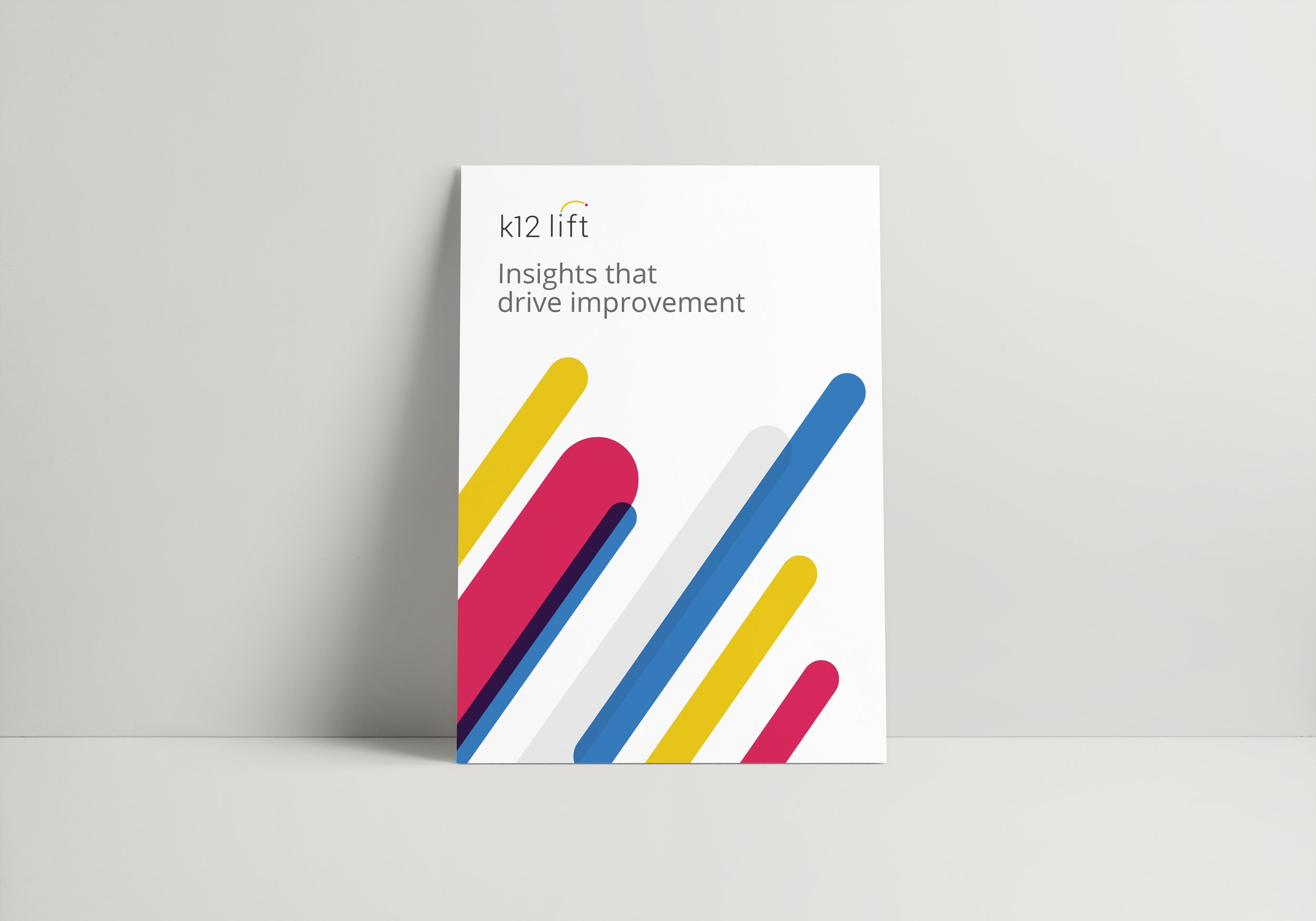
K12 Lift makes current academic improvement efforts more impactful by shortening the distance between testing and useful insights for teachers, principals, and students. The logo visually shows the progress your child can make with the help of K12 Lift. I drew inspiration from a data sheet they gave us, the sheet was showing colored dots on graph paper in the lower left hand corner with different colored dots in the upper right hand corner. This was showing the progress different schools made with the guidance of K12 Lift — from there came the tittle of the ‘i’ jumping in score. I chose the colors yellow, blue and red because they are the primary colors that lay the foundation from which all other colors are built from. For the typeface I was looking for something that fit the mark, something that was light and had some curvature to it, something that complimented the nice little subtle mark I incorporated into the name itself. The new brand is an updated evolution from the original. I took the same idea of the original logo, the ‘plot points’ and ‘graph’ idea, and made it a more subtle reference. The original logo used the tittle on the I to incorporate into the graph, I expanded on this idea and made it more purposeful.


© New York Ave. and K12 Lift