
Branding + Design + UI/UX
Palmetto Realty

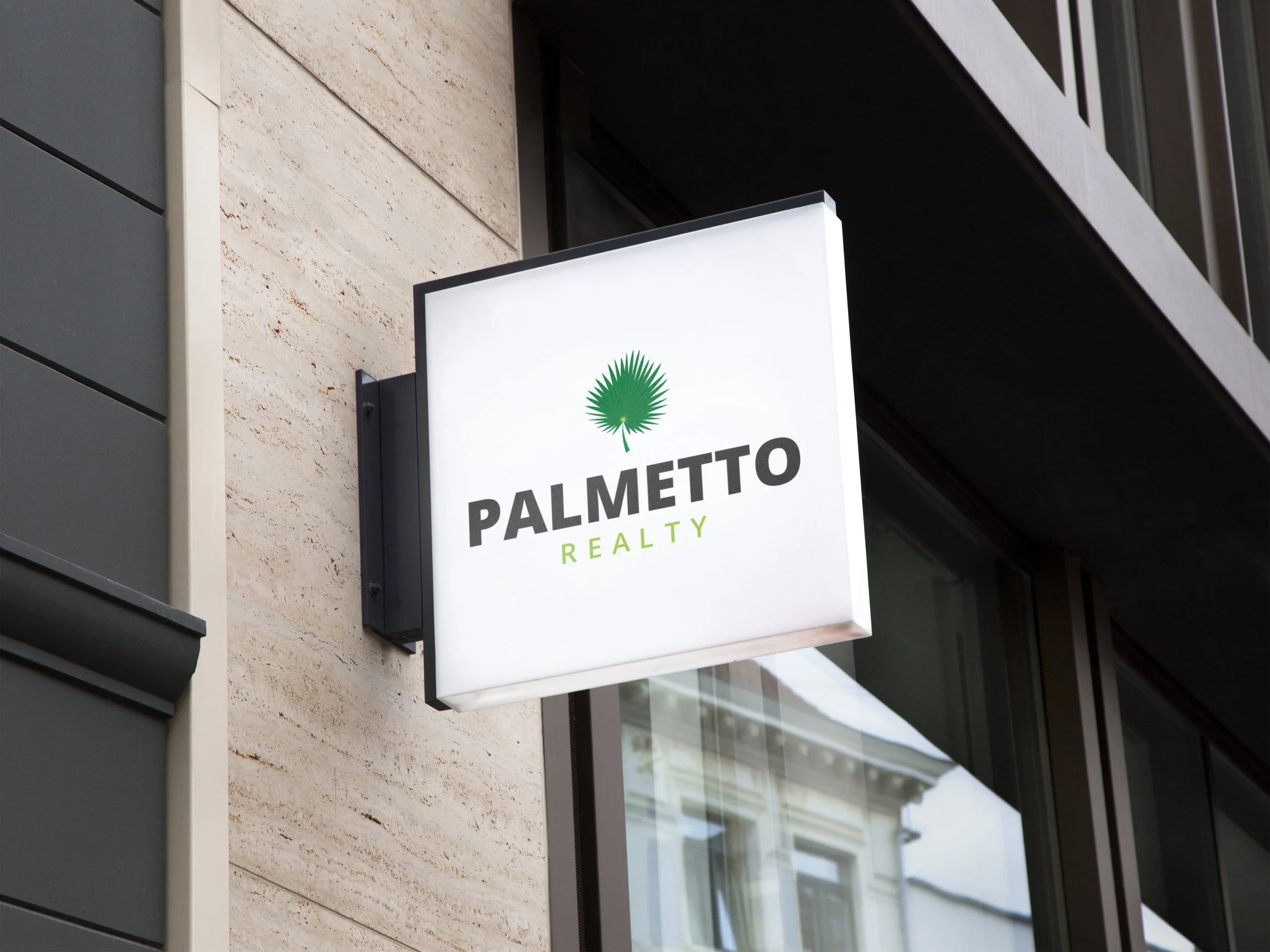
For Palmetto Realty we were starting form scratch. With property and land real estate being their primary goal as well as being located in Florida and having grown up in Florida Chad, the owner, really wanted the palmetto leaf to take center stage in the logo. I ended up going with a version that wasn’t too abstract, nor too detailed. It was illustrated enough to be scaleable while also retaining the Palmetto leaf qualities. The brand is kept high end and professional, with the use of white space, the Palmetto leaf being used as an accent and the subtle splash of green.


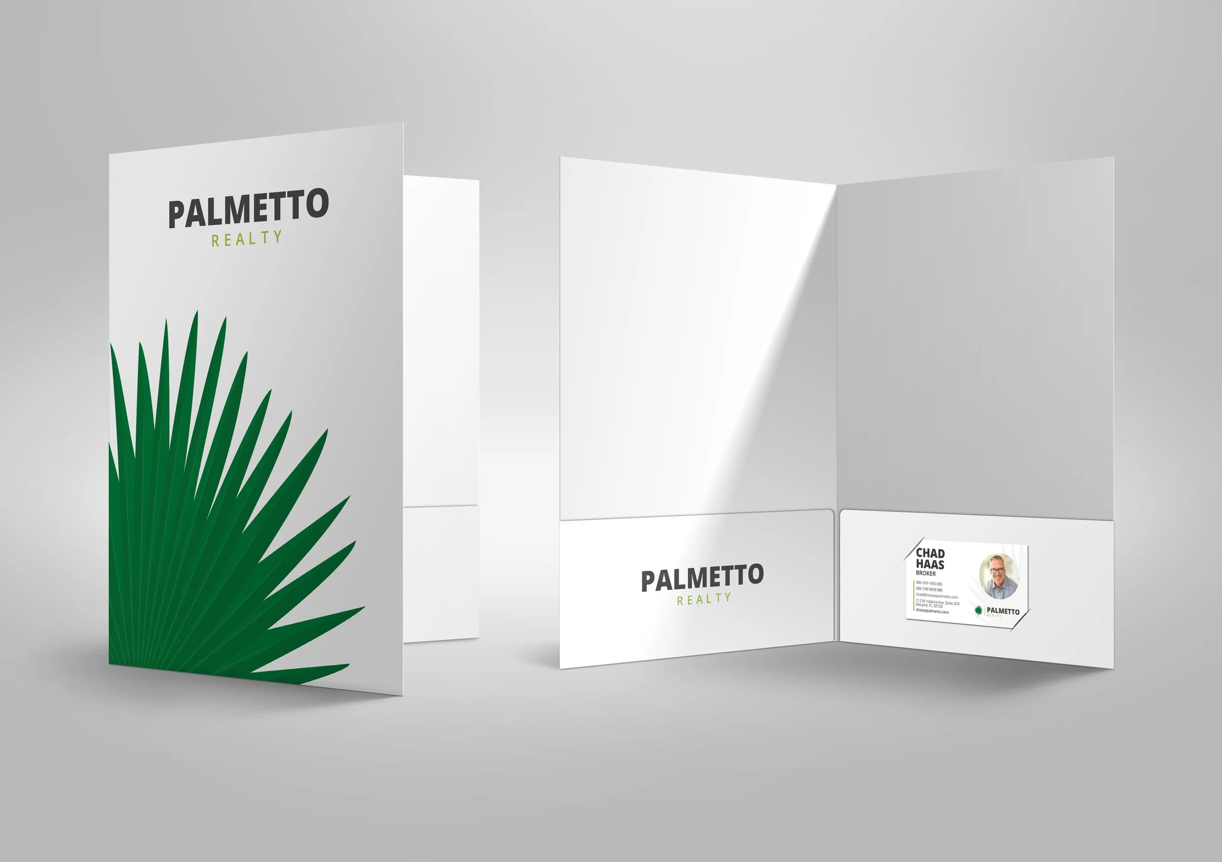
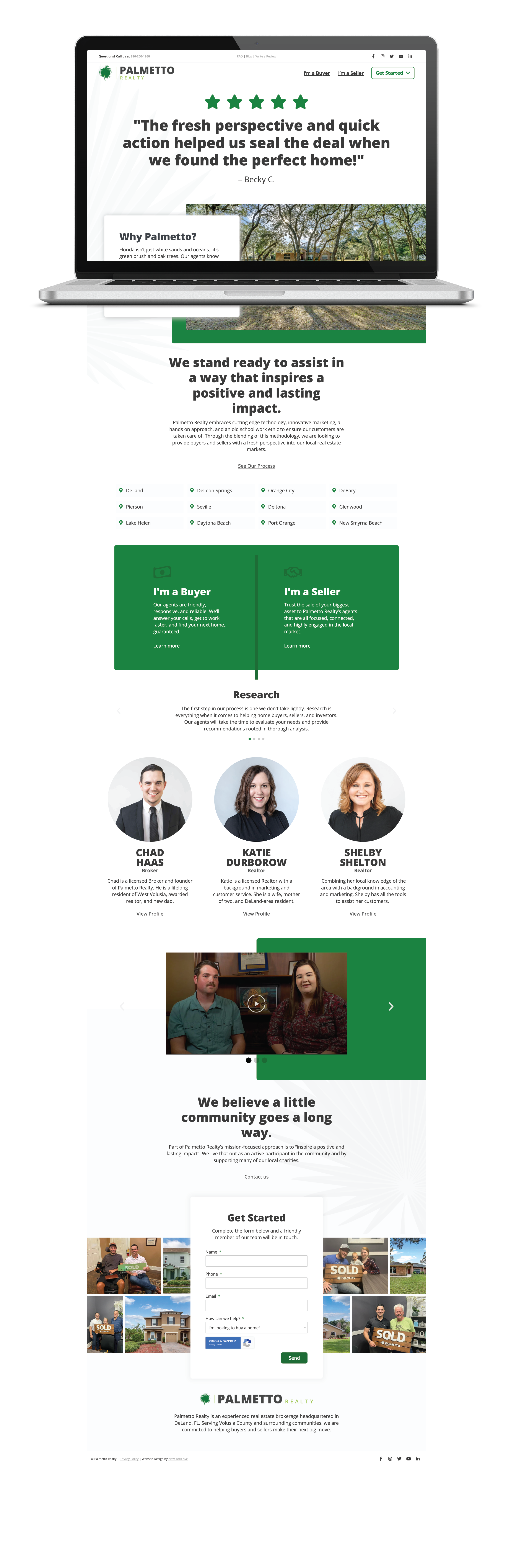
Below is the website that goes along with their branding. I make sure every detail of each brand is consistent and cohesive, the logo, stationary, marketing materials, ads and website all have reoccurring elements and consistency to ensure brand awareness and brand trust. When planning out and building a website a big challenge is making sure the website is user intuitive and that the user is not going to want to leave the site after five seconds of finding it, this site is only a one page site (with the exception of the FAQ, Blog and write a review pages) but still present challenges on how to lay the information out to be user friendly. I think the team and I did a good job planning out and constructing the site so that it flows in a progressive story-like way, feeding the user the information so that they will get their questions answered from first being on the site and engaged enough to scroll through the site, leading them to the call to action.
© New York Ave. and Palmetto Realty