
Branding + Design + UI/UX
Southern Exlusive Realty

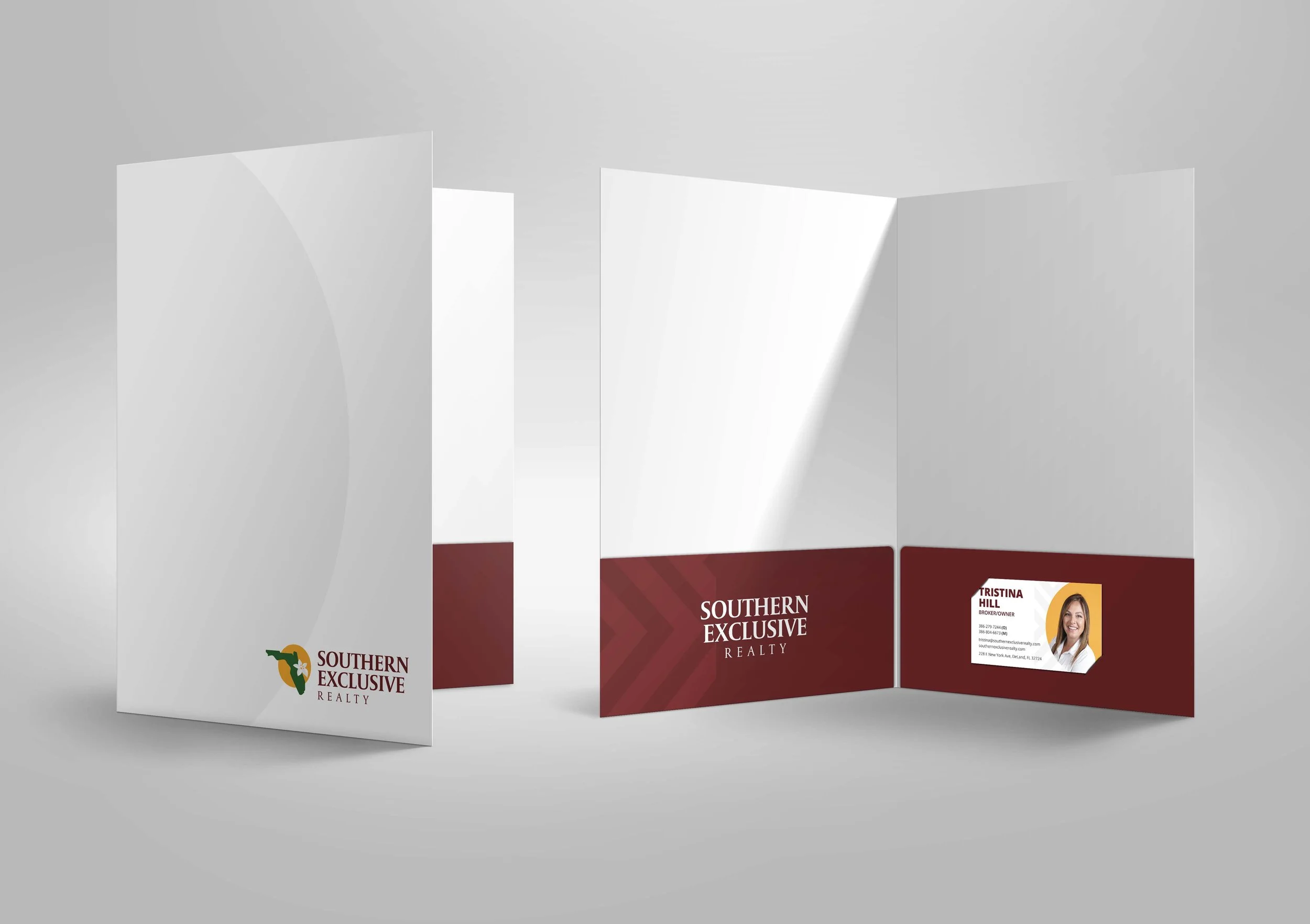
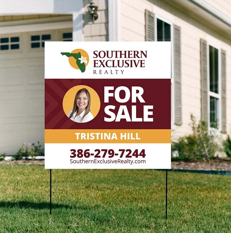
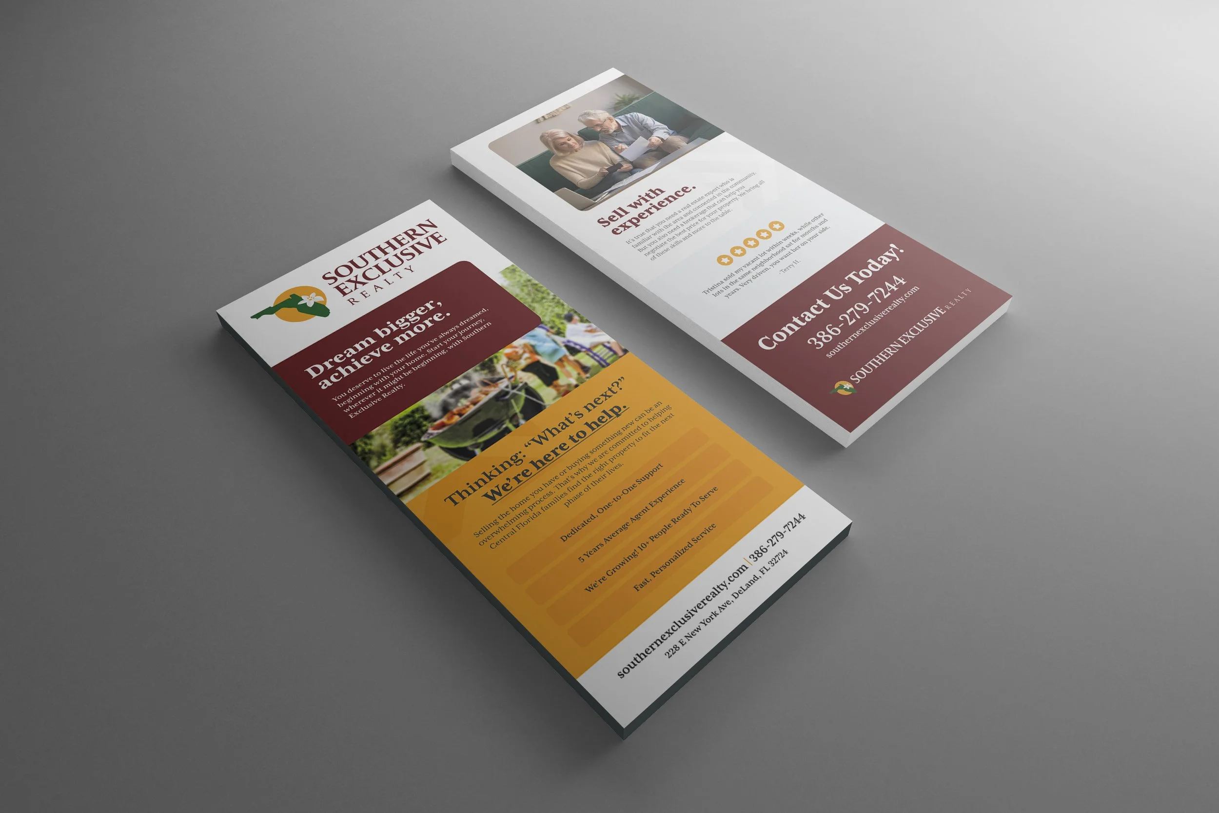
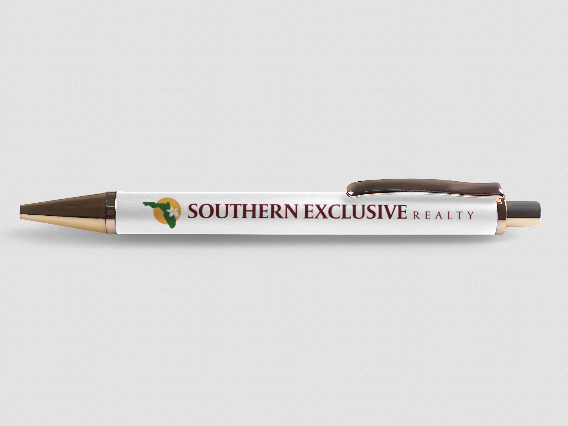
Southern Exclusive Realty is a real estate company that brings the southern hospitality to all their clients. This was a brand refresh, before it was the state of Florida in maroon. So to liven the brand, while staying true to their original logo I picked a nice elegant serif typeface (Mrs. Eaves) and gave some color to the logo. With the Florida theme being so important to the company I added an orange blossom in the exact location they are located, the orange blossom being the state flower of Florida. Behind the state I added the orange circle to allude to what Florida, specifically the Orlando area, is known for — Oranges. It’s a subtle and abstract way to show this Florida motif while also anchoring the state with the typeface.
I developed a pattern of arrows that are moving forward, showing the progress you will make with Southern Exclusive and how they are constantly driving you forward to your goal.


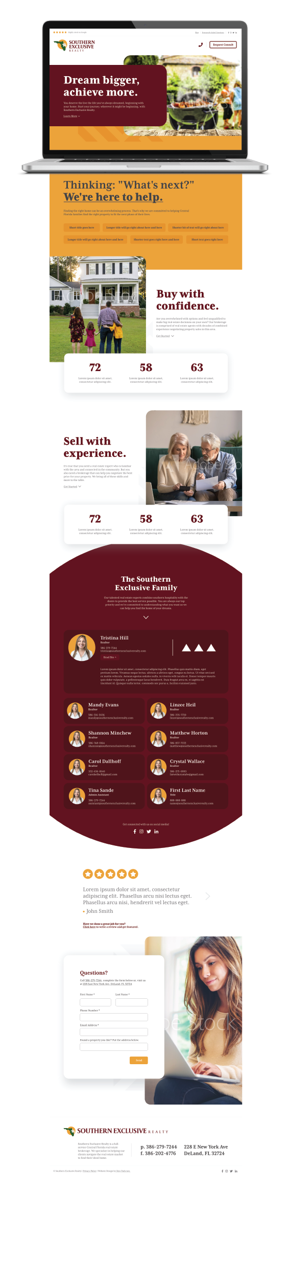
Below are mockups of the website. To make sure all the elements go together and the flow is consistent, I mockup what the finished website will look like, I then hand it off to the developer and they take the mockups to make into the finished site. The mockups act as a roadmap to how the finished site should look, how it should interact with the user, how it should read. Mockups done in Adobe XD.


Here is the abstract arrow pattern I created for Southern Exclusive Realty. In all my patterns I create I make sure there is a reasoning behind the pattern that supports what the business does or ties back into the logo design.


© New York Ave. and Southern Exclusive Realty