
Branding + Design
The Florida Practice
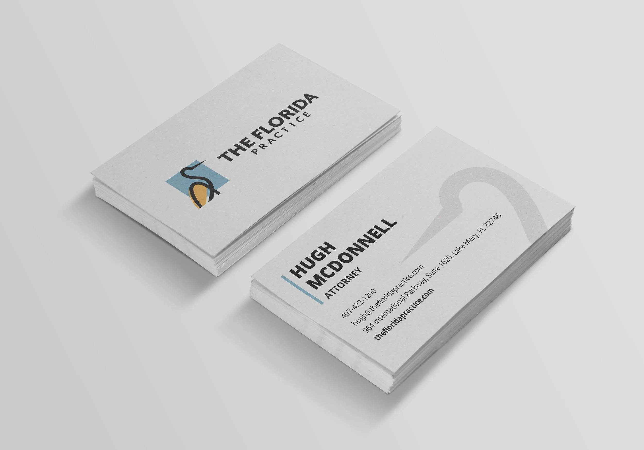
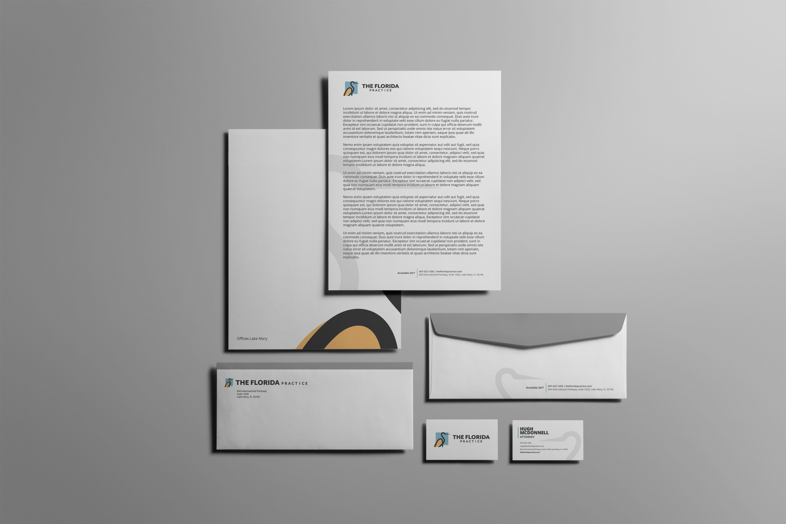
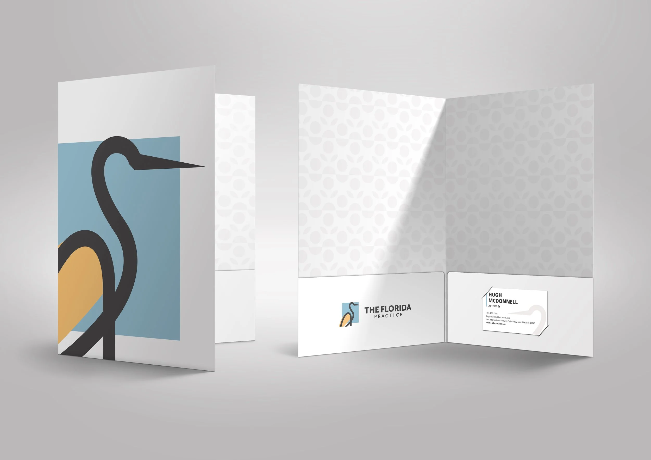
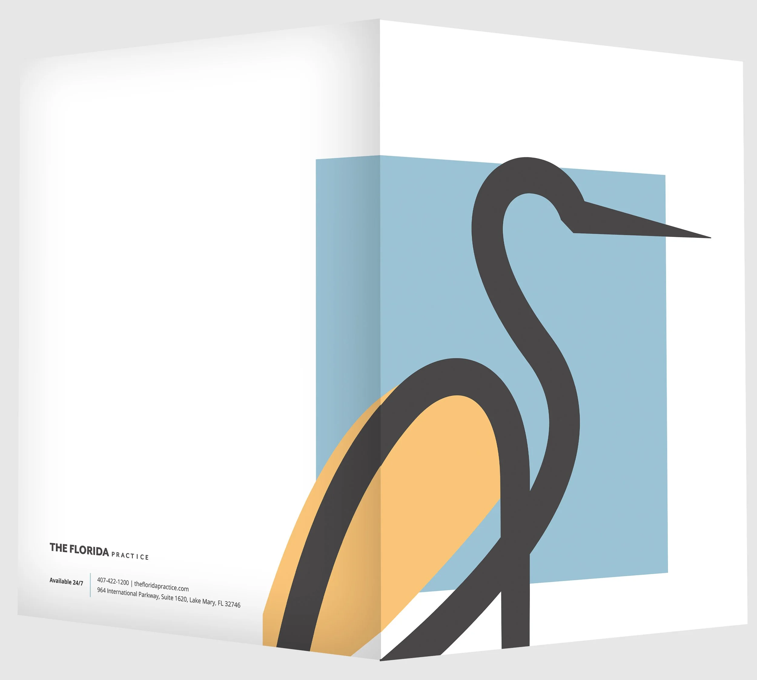
The Florida Practice is a law firm that serves Volusia County and the Orlando area. This brand was fun because I was to come up with a completely new logo, that was professional but not your stereotypical ‘law firm’ logo. We wanted this brand to stand out from the law firms with the gavels, scales and courthouses. After sketching several different ideas I was inspired by a bird that you see all around Florida, and one that I found was prevalent outside the Florida Practice’s office, the Crane. I did some sketches, abstracted what a crane would look like and the logo was born. I think it goes with the brand because being ‘The Florida Practice’ having a bird that is native to Florida only makes sense. The crane also symbolizes the need for balance and living in harmony — which are some of the values The Florida Practice strives to uphold in their company and how they practice. To tie back into that theme of ‘Florida’ in the brand I created a repeatable pattern that is an abstract representation of a Florida Orange. You can view the pattern on the inside of the Folder design.

© New York Ave. and The Florida Practice