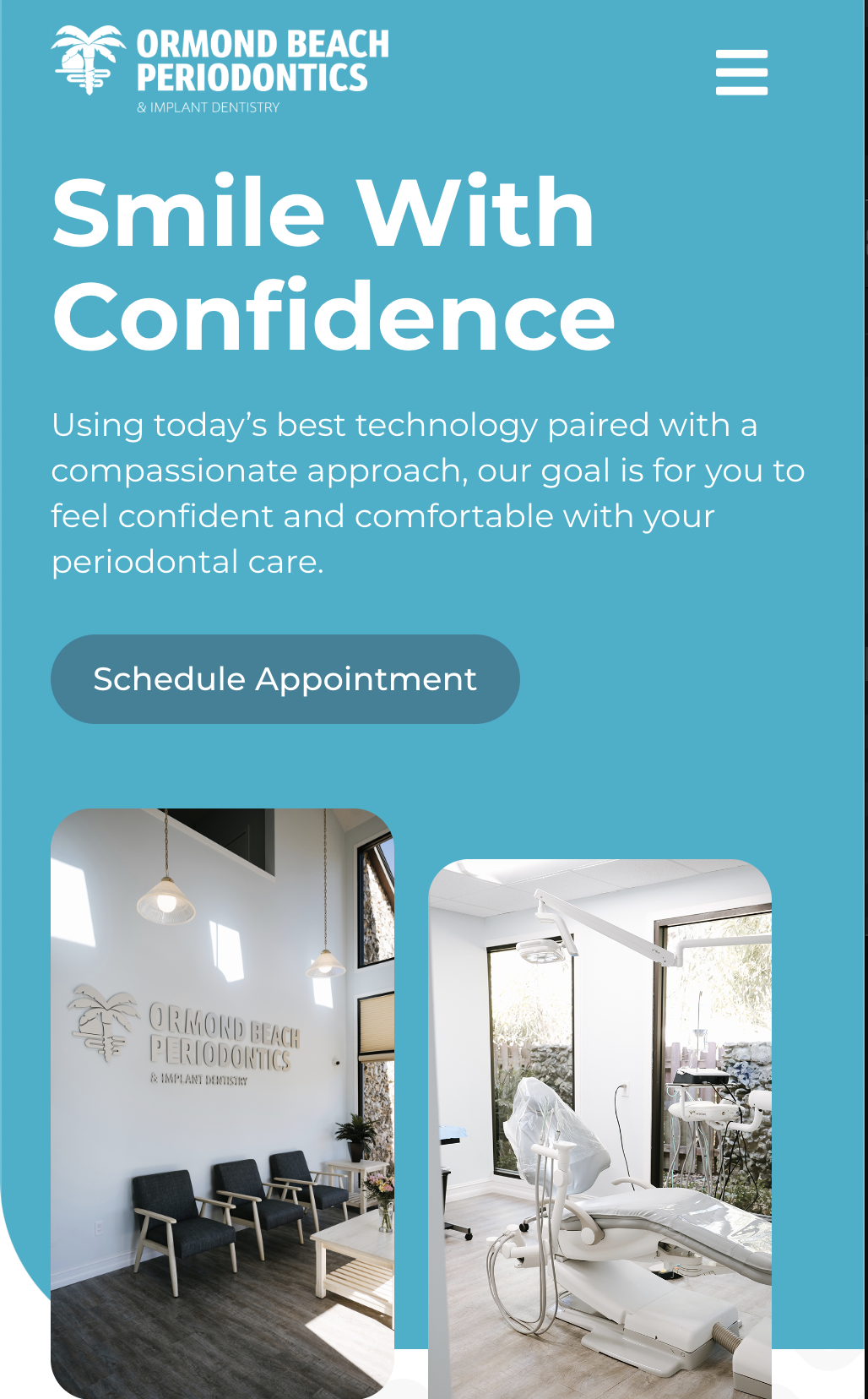
The Goal
Going to the dentist is never a fun experience, our goal was to make the brand feel energetic and friendly to take some of that hesitation away. The brand not only had to visually look inviting, it had to engage in the same way. The appealing photography, subtle roundness, bold bright colors, animated load ins and button interactions all helped to achieve this goal.
Planning it out
When wireframing out the pages, I often times work with our development and creative team, making sure all our ideas are possible and plausible. To keep information organized for the mockup, prototyping and development stage we make color coordinated notes to reference back too. Yellow being Content, Blue: Development, and Pink: Narrative. This not only makes referencing useful but ensures the narrative and journey of each page stays on track.
The use of patterning and background images is great for filling space, but it also acts as a way to anchor elements together and moves the user down the page to the next bit of content. It also acts to direct them to where we want the user to go, since visual elements are seen before text in the hierarchy of layout, these subtle visual cues not only stop your eye but directs it to the text that might have been otherwise overlooked.
Below showcases my mockups process, where I use Adobe XD to flush out the wireframe with colors, fonts, photos and patterning to give a true and finished product. I then pass it along to our copywriter and work with them to ensure the copy stays true to the brand tone and overall story we have build out in the storyboard.


