Branding + Design + UI/UX + Layout
AchieveAbility Therapy Solutions
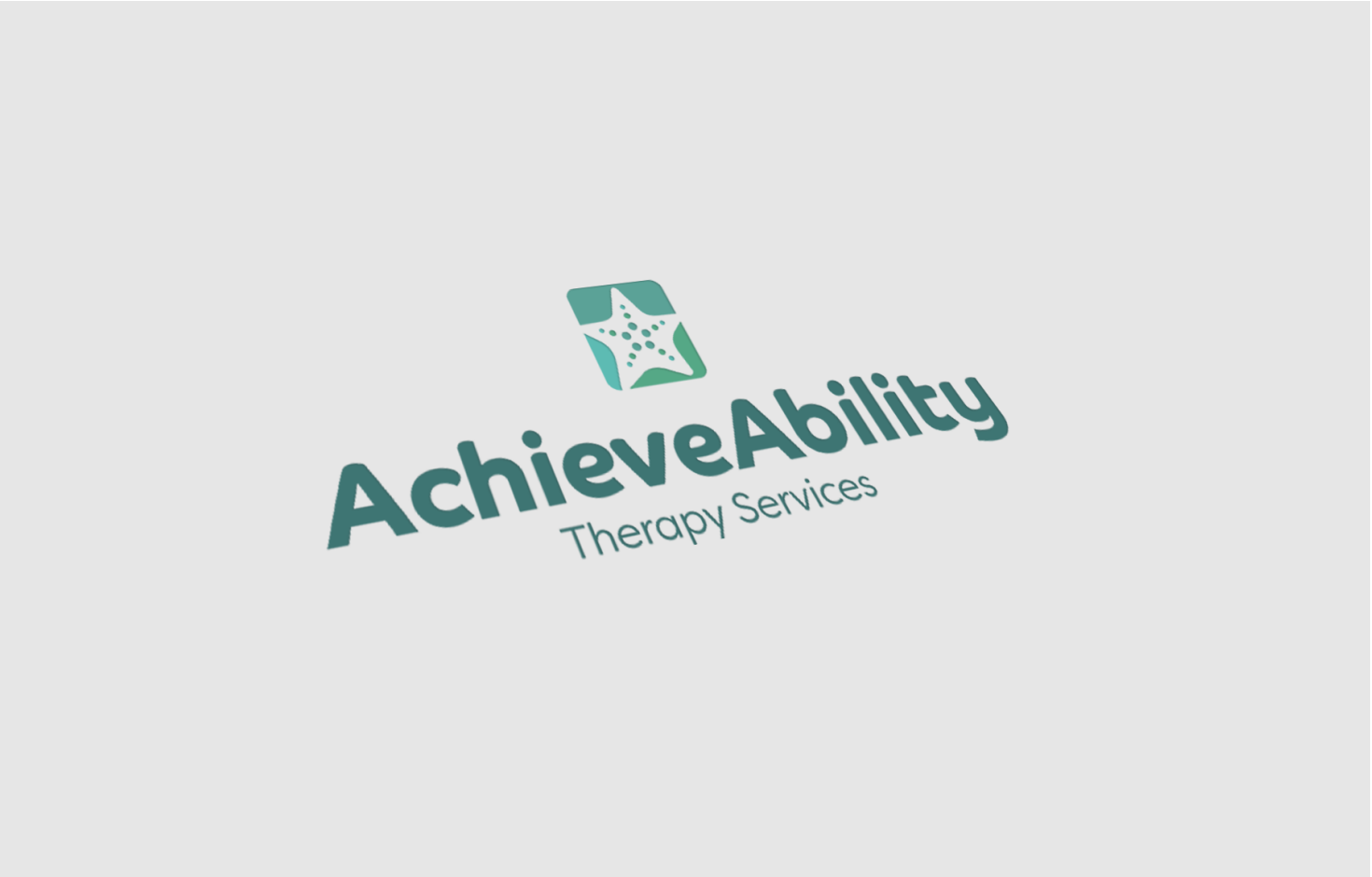
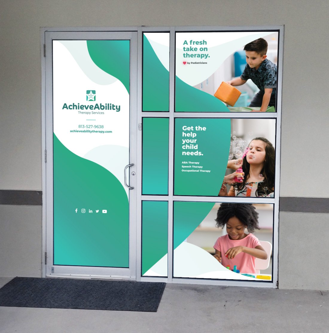
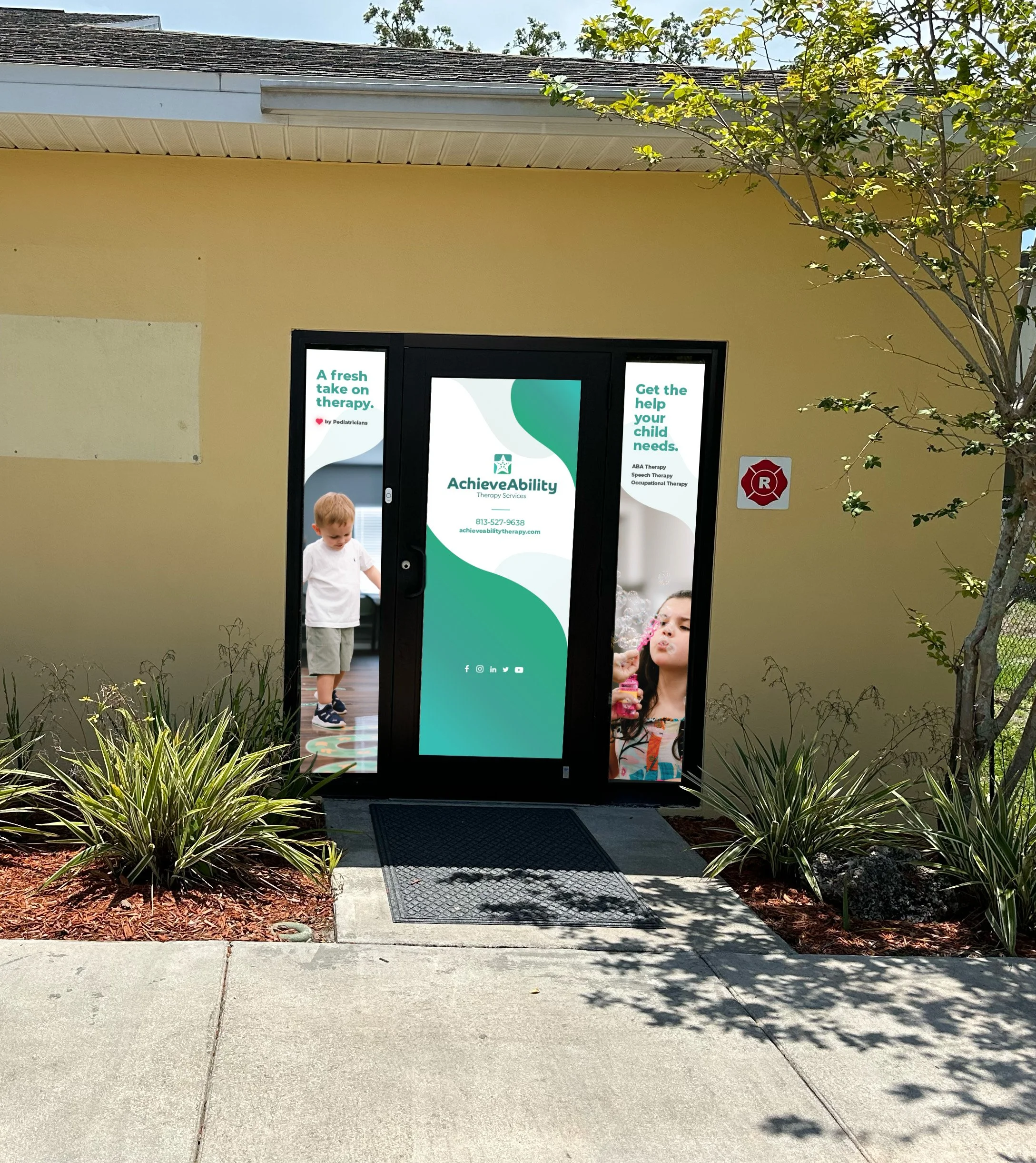
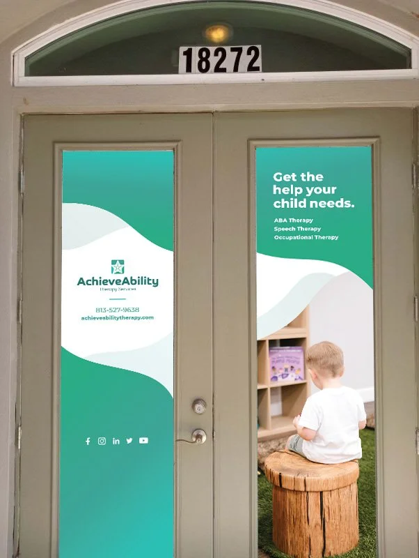
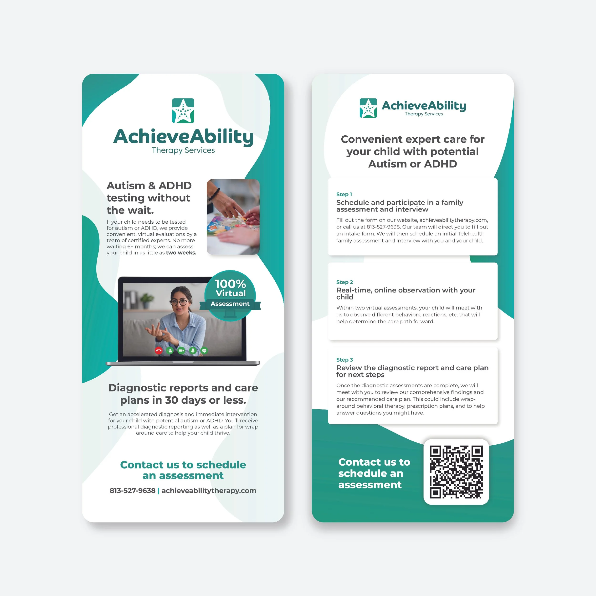
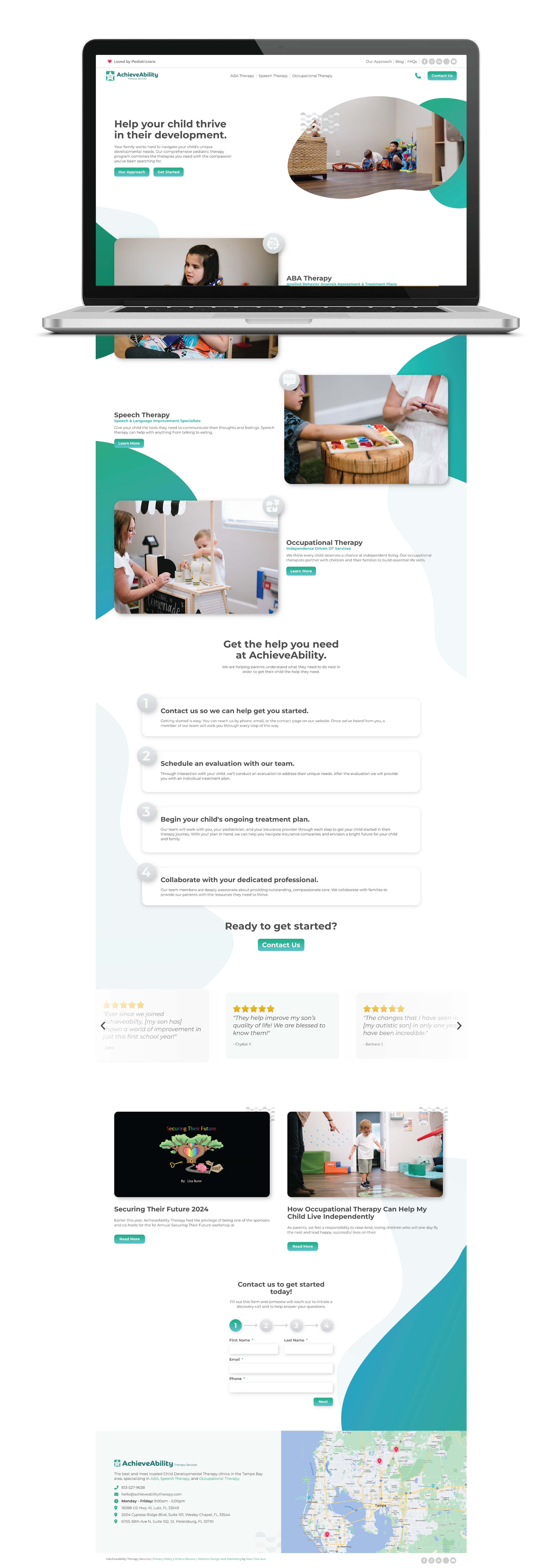
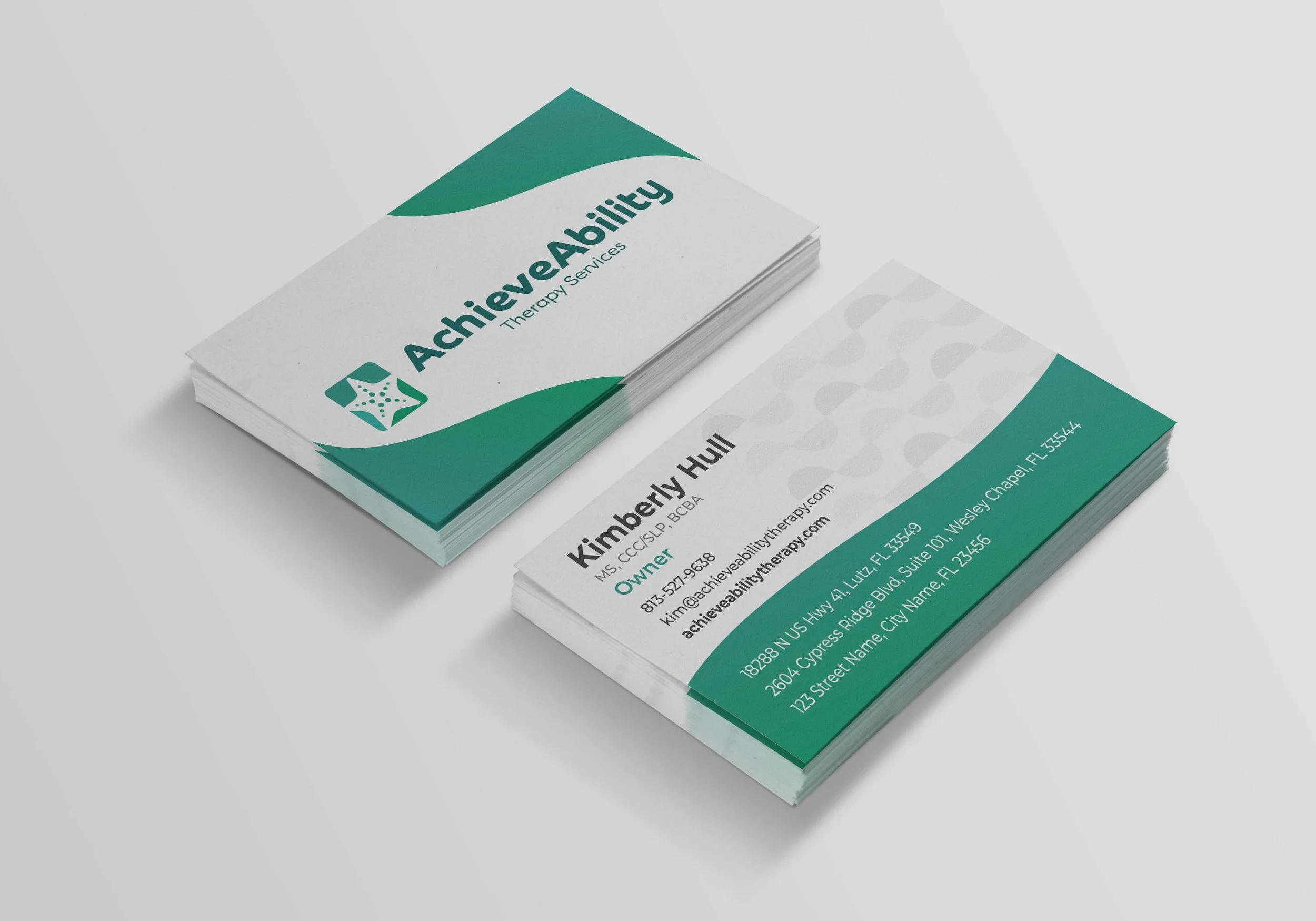
AchieveAbility Therapy Services mission is to give expert help to children struggling in their development. Working with children, I wanted them to have this very organic, relatable, child-like feel in their logo and branding. But even going a bit further - I wanted the branding to give off a sense of calming, tranquility and trust. This was a rebrand so I took the already starfish logo they had and softened it up, making it feel more organic and a bit more playful. Adding in the three shades of teal was a subtle representation of their three main therapy services they provide, ABA Therapy, Speech Therapy and Occupational Therapy. The rounded organic typeface made the brand not only feel more relatable and whimsical but also gives off a sense of tranquility and trust, but paired with a sans serif subtitle to keep it professional.
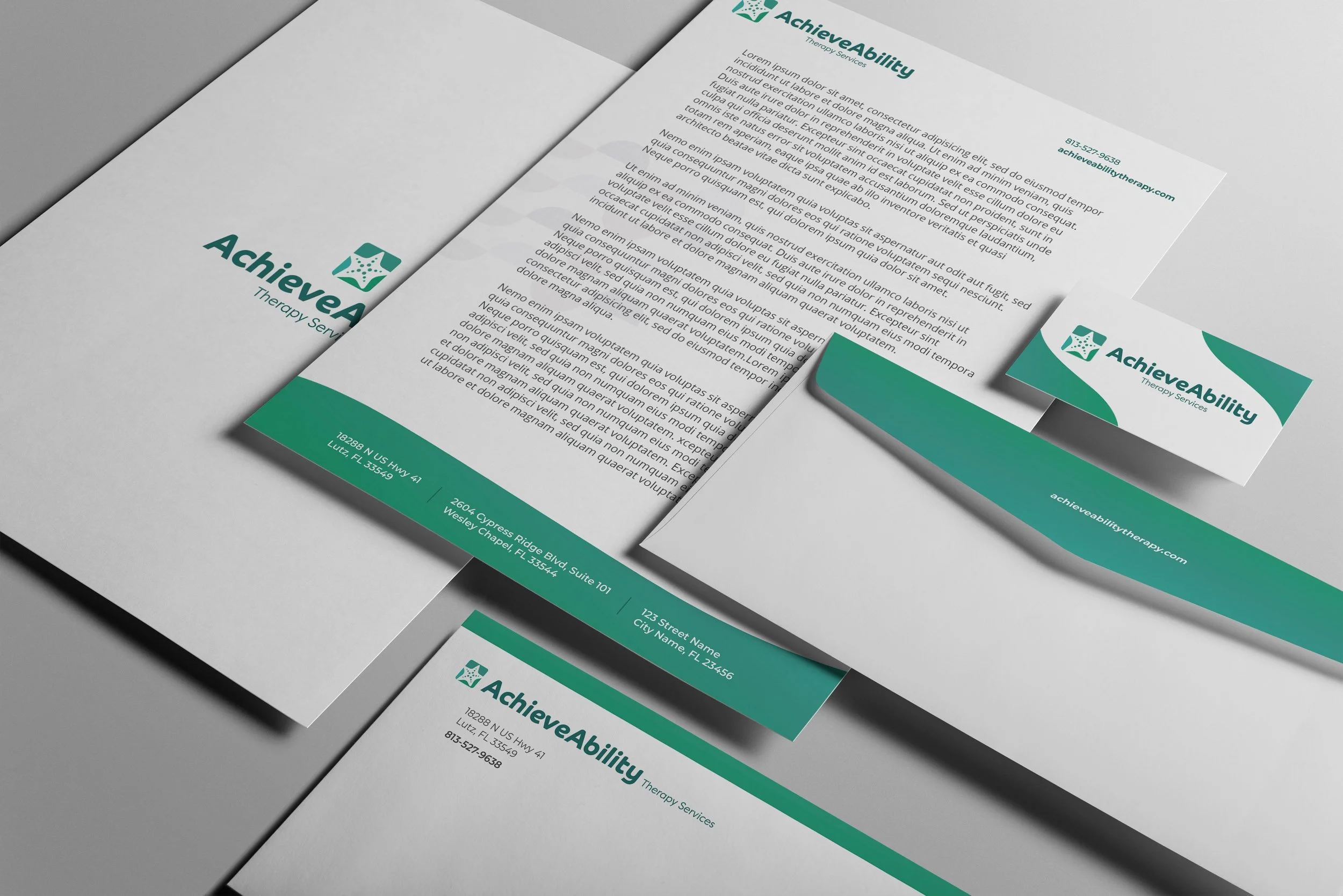
The pattern I developed was reminiscent of waves in the ocean, created in a modern composition to relate back to the logo. The overall branding uses the four brand colors in a very soft way, and in a very organic manner. I always use soft or rounded edges to keep the branding as organic and friendly as possible, going back to relating the brand to what would make children feel welcomed and parents feel confident.
© New York Ave. and AchieveAbility Therapy Services

