Branding + Design + UI/UX
Andrew & West
Andrew & West, a consulting agency made up of two brother, wanting to take hold of a higher class of clientele, came in need of a fresh brand that stood out and set them apart. Their goal was to reach companies that were well established and grew to the point of needing direction in their next step forward. In order for them to get these clientele, they had to look the part.
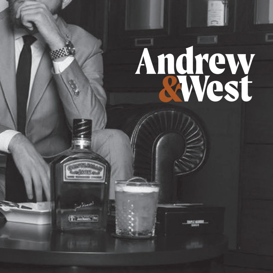
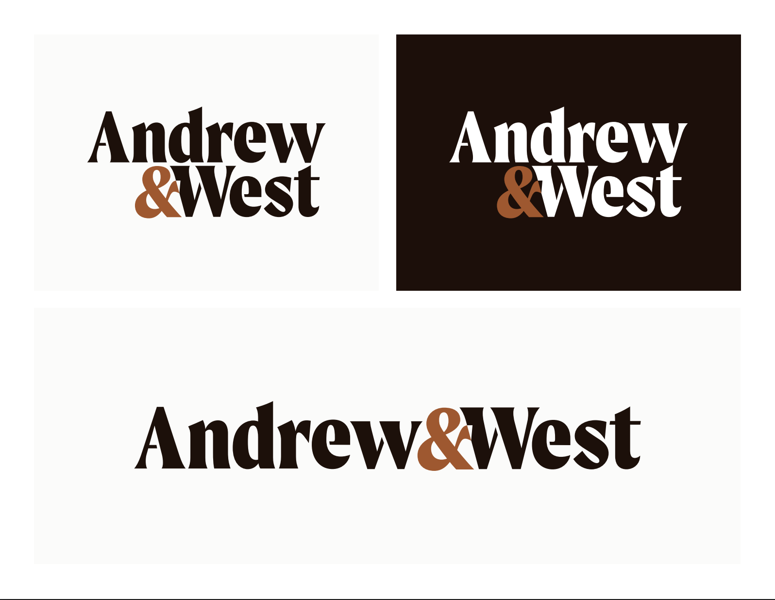
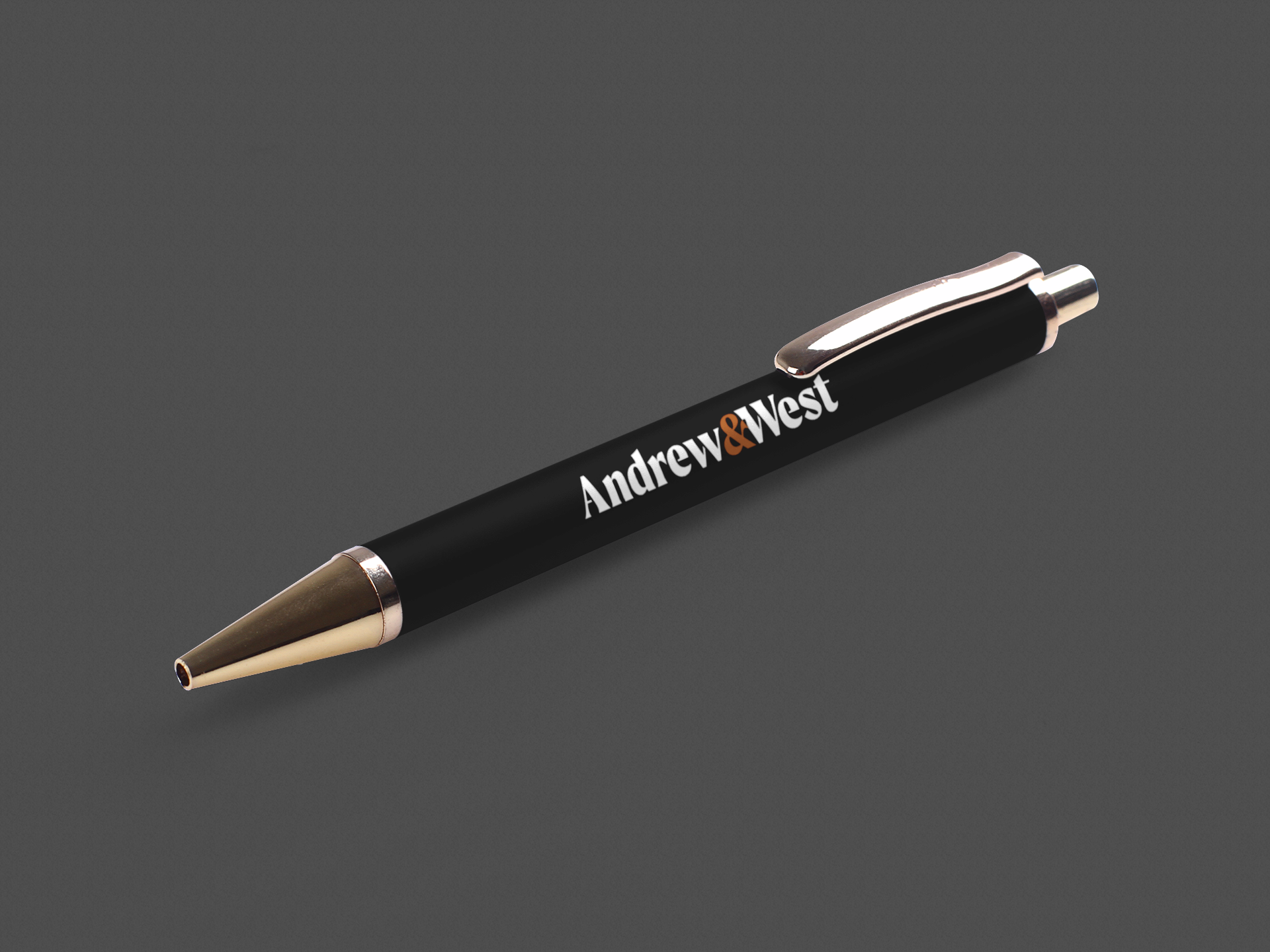
In order to do so I leaned into the classic and classy ‘Mad Men’ look. From the photography, use of classic yet modern serif headings and sans serif body font, to the dark and light brown in the logo the brand as a whole feels vintage yet updated to fit into this modern world.
They just needed a very simple site. But simple doesn’t always mean boring, because their branding is minimal yet striking I wanted the site to have that same emotions. As you scroll down the page you learn, in an interactive way, why you would need Andrew & West, what they provide to businesses, who they are and why they’re a good fit, and how they could garner success for your business, finally leading them to a Call to Action. The site feels very intuitive and takes you through a journey and guiding you in a way that answers one’s questions and concerns they might have when choosing to go with a consulting company.
Below you can watch a walk through of how the site scrolls.
© New York Ave and Andrew & West

