Branding + Design + UI/UX + Illustration
New York Ave
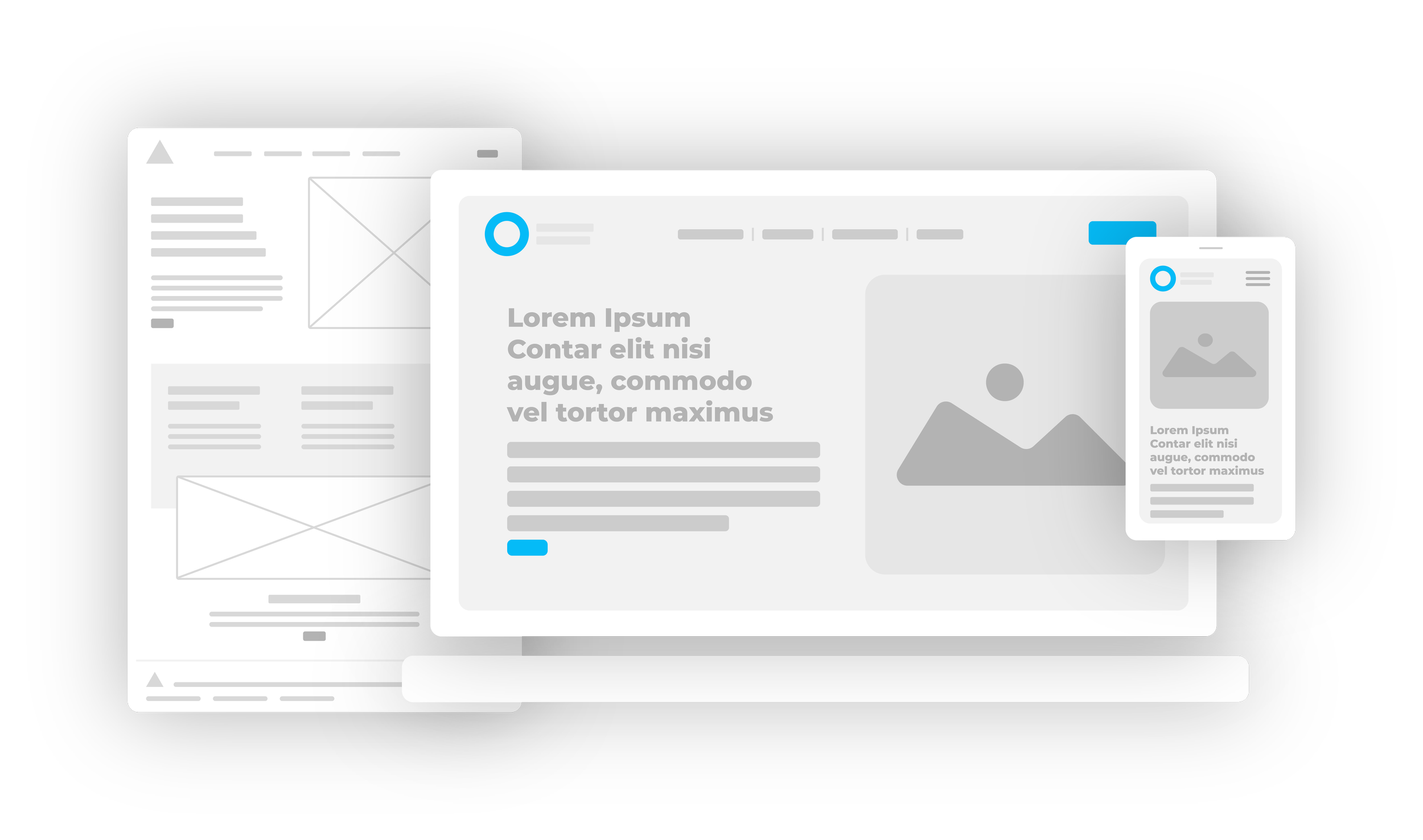
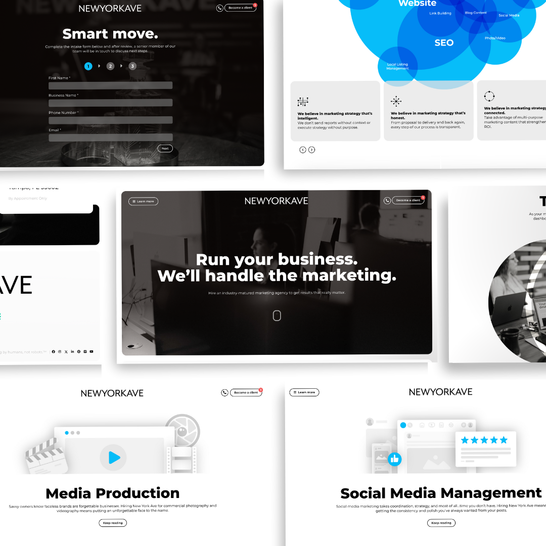
I helped in rebranding New York Ave into a more mature tone, garnering a higher end clientele. From wire-framing, storyboarding, the mockup phase, even down to creating all the assets and illustrations, I was at the helm of the UI/UX of New York Ave’s site. The site had to be sleek, be minimal and tell a story, while also guiding the client through and getting them to where they needed to go. We turned towards app user interface and experience when making decisions for how the website would be interacted with, this not only made it feel sleek and modern but gave users an easy way of using the site and one to which they are already familiar. The new brand uses a limited color pallet, putting pops of blue when their is a call to action or the user is needed to take action. The limited use of color and type helps to simplfy things for the user, making the journey feel more easy and guided.
Below are illustrations I created showing in pictorial form each service New York Ave offers, from graphic design, email marketing to social media management, analytical consulting and videography. These illustrations make the service not only easier to distinguish at a quick glance, but also helps to show just what that service is.
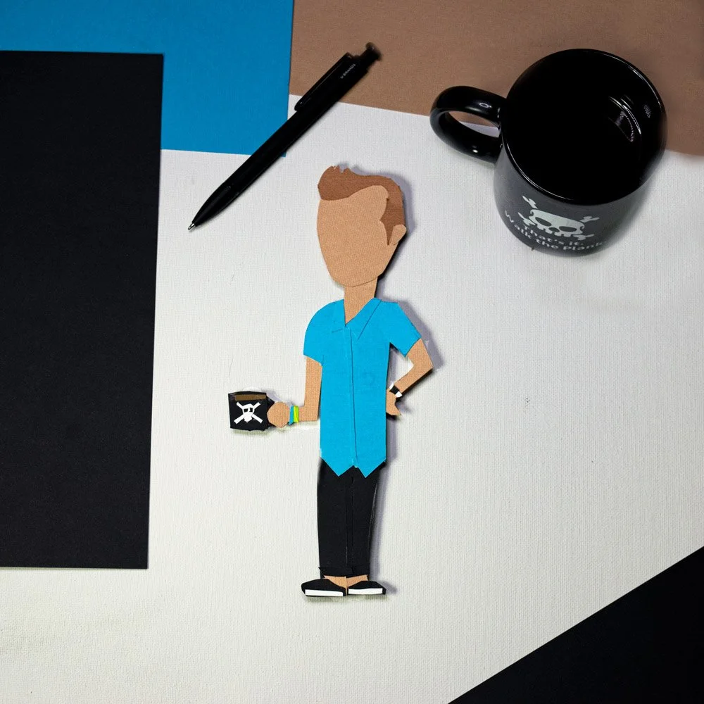
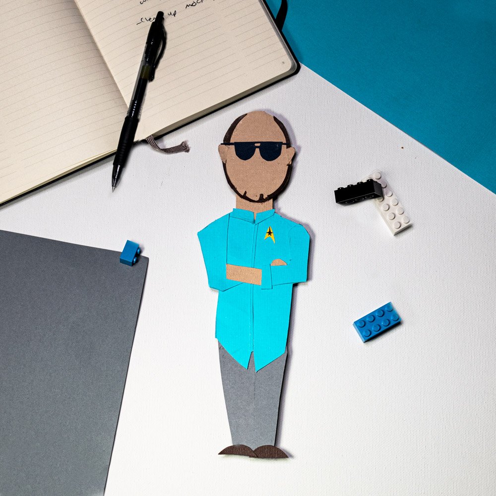
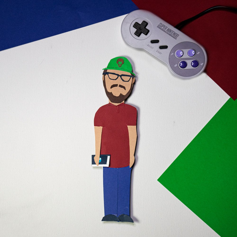
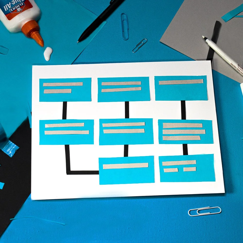
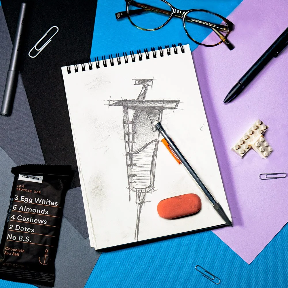
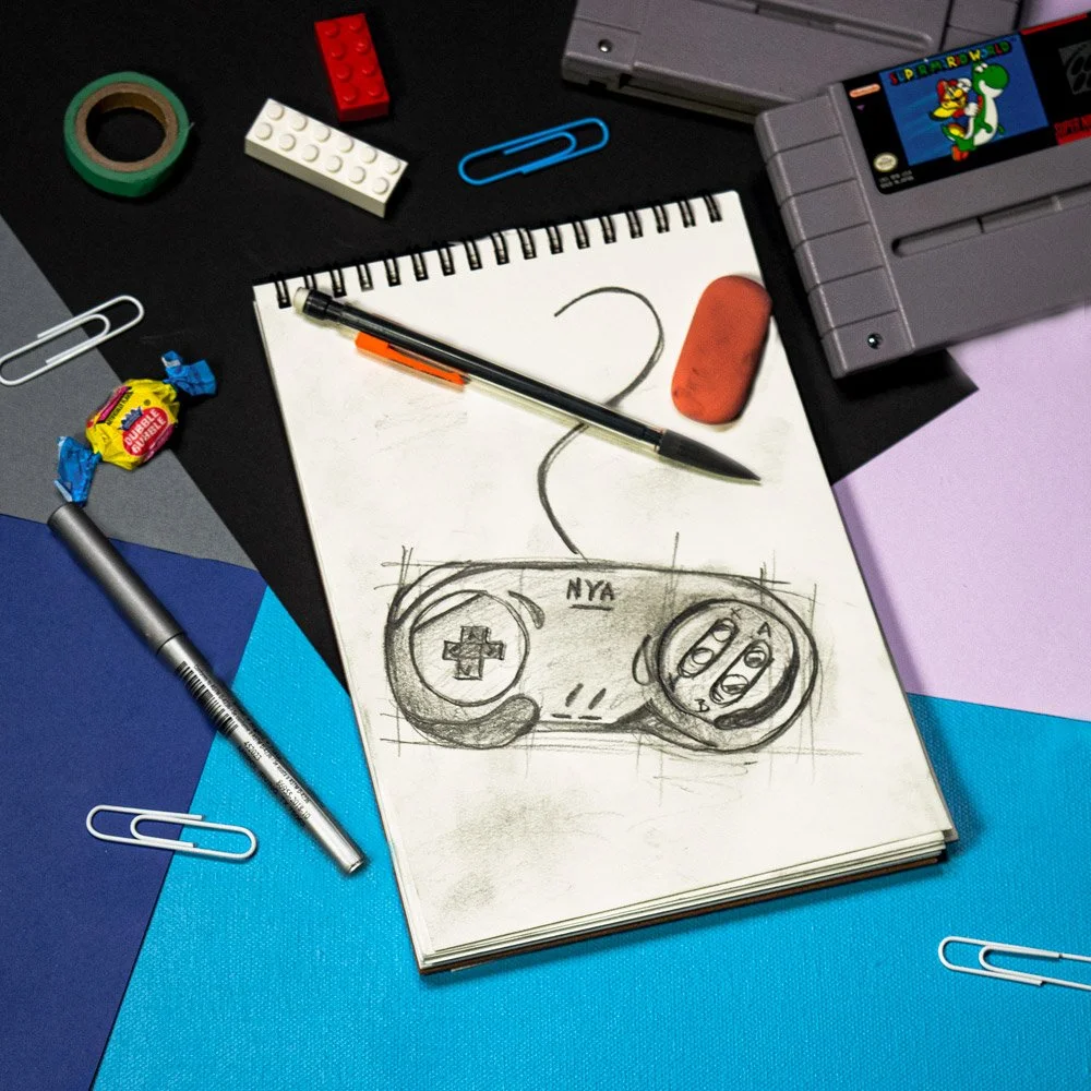
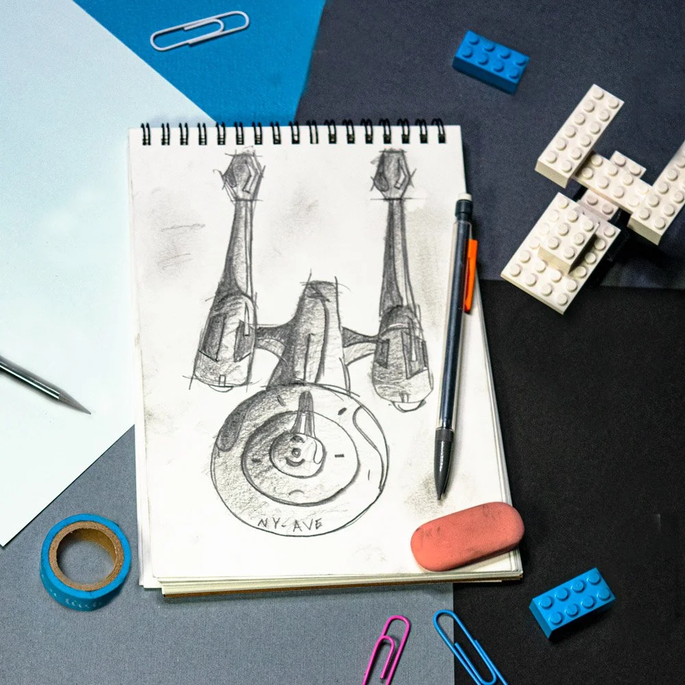
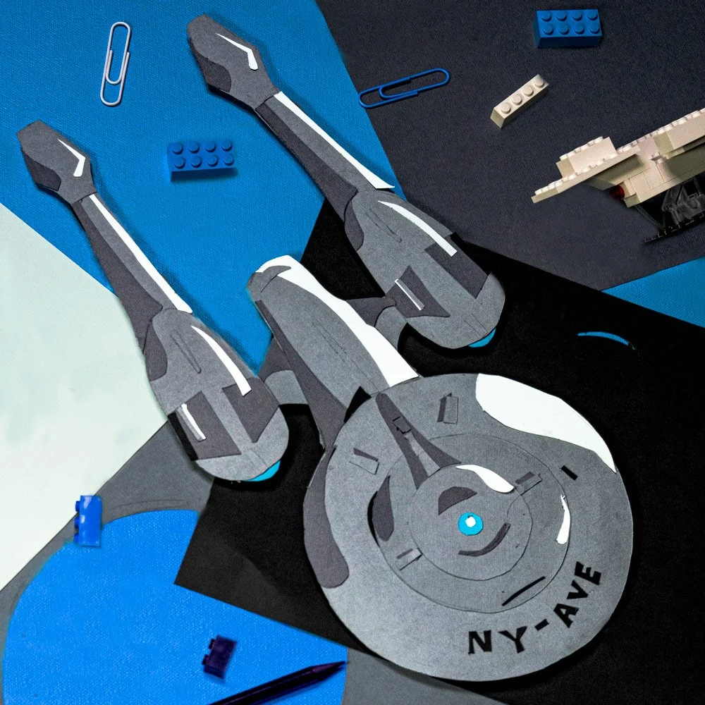
As a creative agency, you have to have creative branding, and I helped in doing just that. Below are cut paper ‘illustrations’ I did for a campaign New York Ave put together to promote and advertise themselves. From creating the wireframe illustration, meticulously cutting and gluing each person and element together, to composing the layouts and photographing each composition, I was in charge of the project and it’s vision from start to finish.
Below a few of the team illustrations is the wire-framed objects that make up the different aspects of New York Ave, whether it be cultural, service based or clientele, on the left with the concept of each object constructed piece by piece on the right.
© New York Ave. and New York Ave.


