Branding + Design + UI/UX + Advertising
Choice Health Insurance Brokers
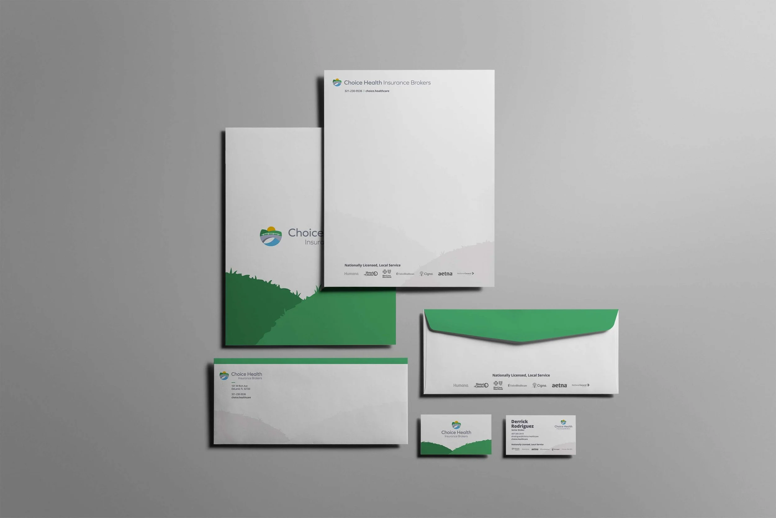
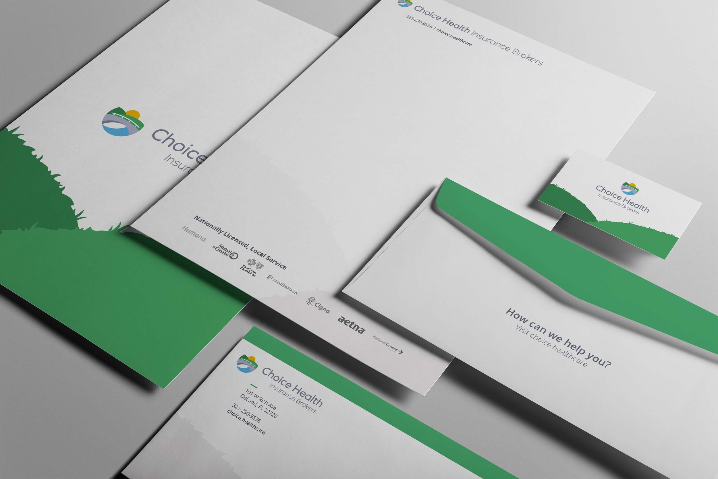
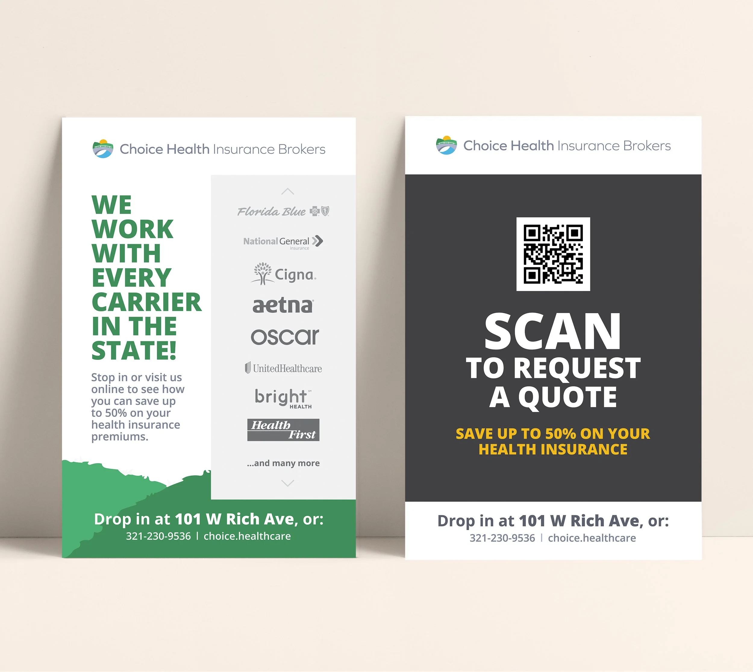
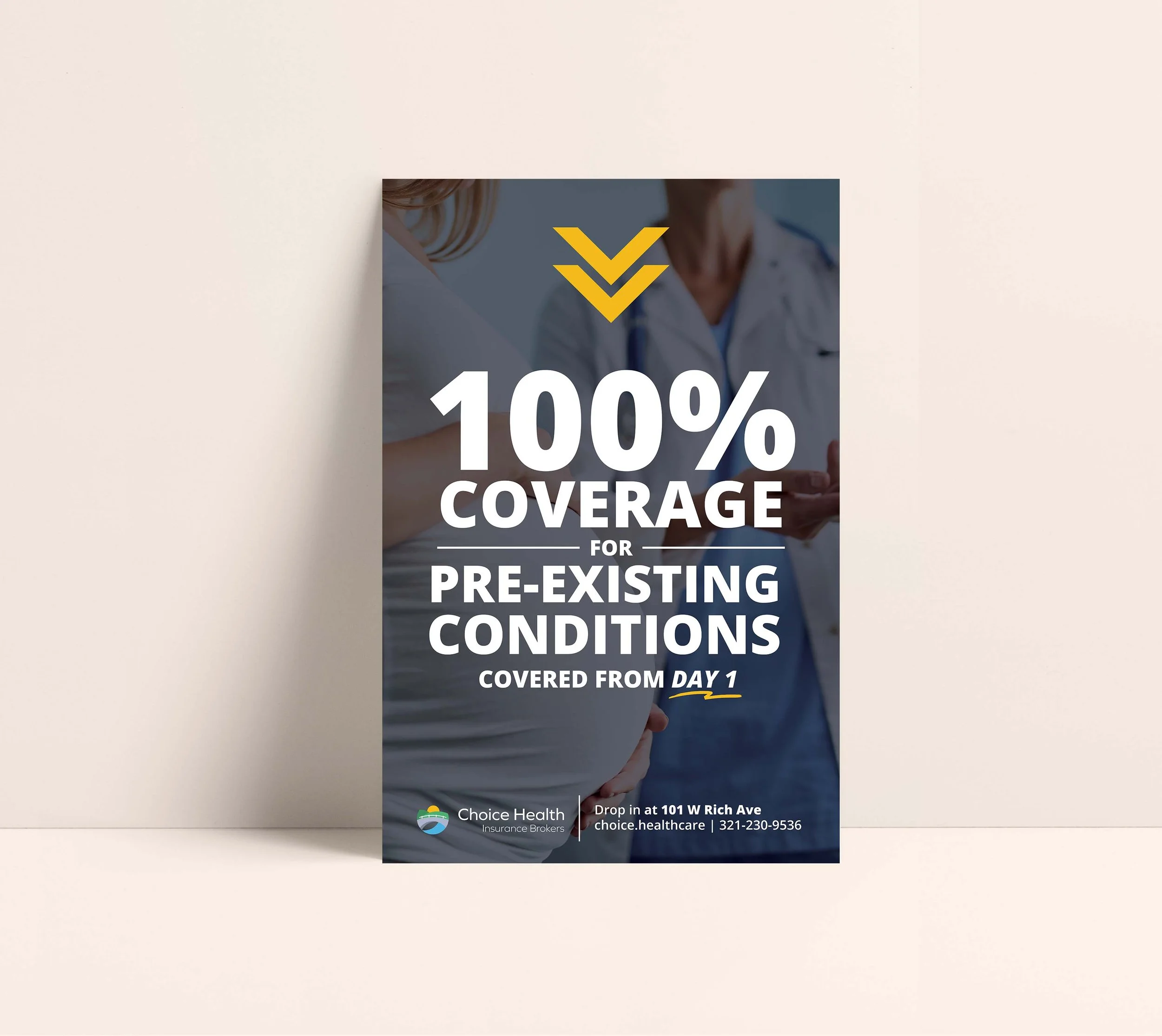
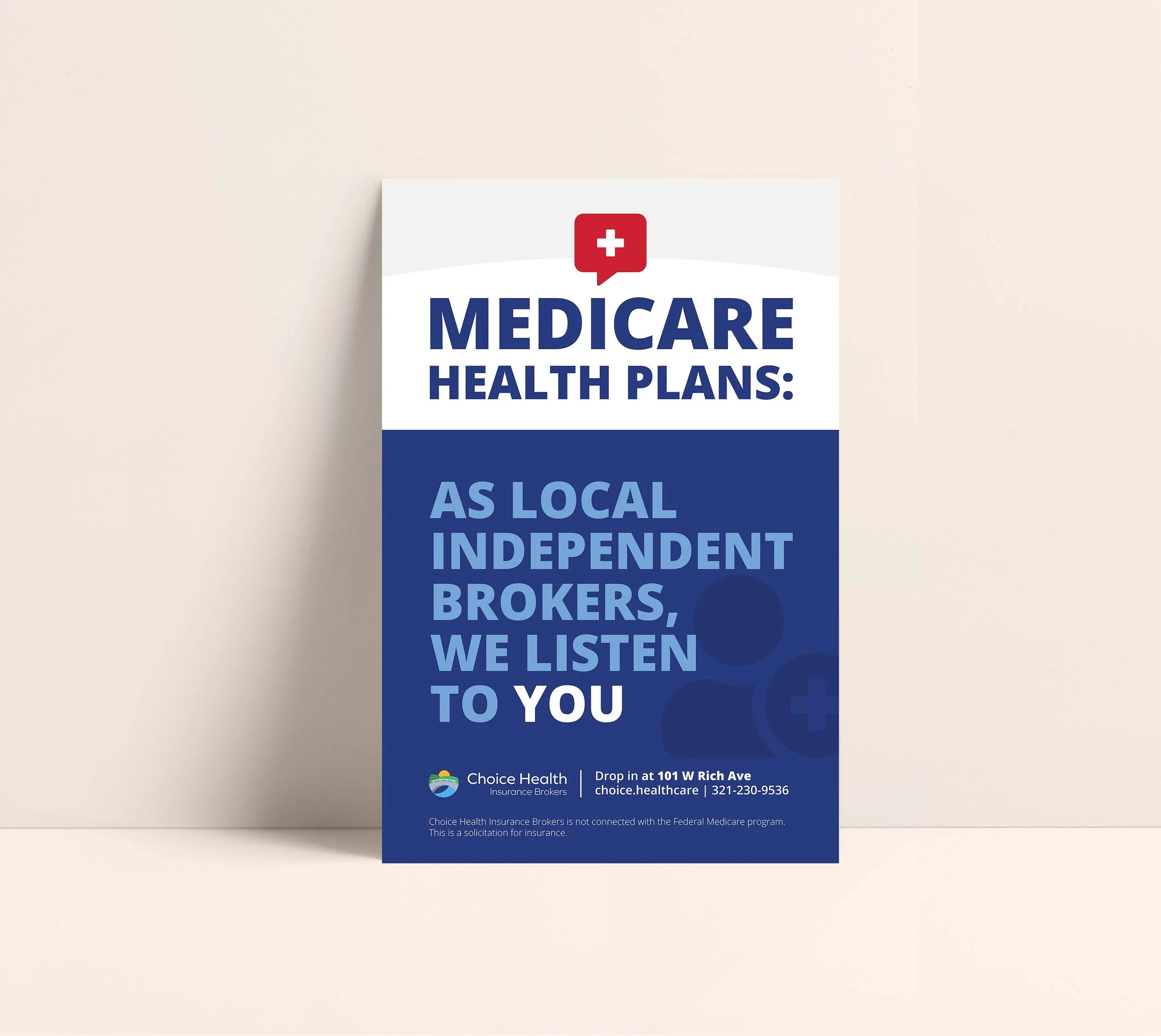
Choice Health Insurance Brokers is an insurance company ready to bring a brighter tomorrow. I was in charge of creating not only the logo, but also the look and feel of the brand. I wanted to keep this logo very organic, to do this I let this circular look influence every aspect of it. Every element is created with the golden ratio, making it perfect. The green really influenced the brand — bringing back the idea of the brand being organic, breaking the mold of insurance companies being serious and daunting. For the brand I created the stationary components, some posters for advertising, the website, signage, table cover and flyers. I took inspiration from the logo and recreated a more illustrative style of green hills to incorporate into the rest of the branding materials, brining to life the brand and logo.
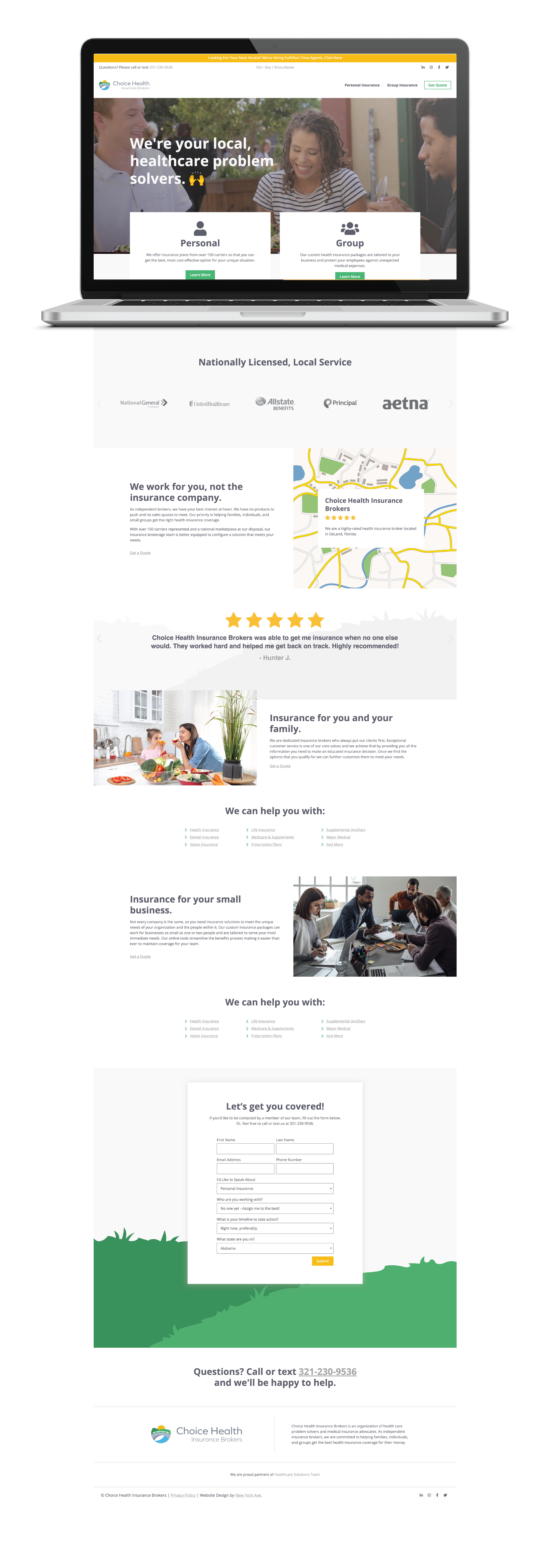
With every brand development the client gets a website that compliments the brand, making their brand cohesive and unified. I also help to layout the websites and create a pleasant and engaging user experience.
Below is the home page of this site I designed. Starting out with a wireframe, then sketching a storyboard of each page, and ending with mockups I create in XD to better understand and visualize how each page will look and interact before going to development. The finished result is what you see below. This site was a smaller one page site, with the exception of an FAQ, Blog, Write a Review and Privacy Policy pages.
© New York Ave. and Choice Insurance Brokers


